1st Photoshop Web Design Professional Layout Tutorial
Hello there! I know I’ve been promising tutorials over here for a long time, but as we all know things do not happen so fast as we wish, but good thing is they happen at all! Previous week I did a lot of designing, practicing myself, started to use DeviantArt more seriously – there are really good community! If you are DeviantArt user check out my profile there – dainix.deviantart.com – from now on, I’ll upload there new,fresh designs regularly!
Oh, and if you have never been using deviantart as community, I will definitely write an introduction article about DeviantArt revealing my good/bad impressions and discoveries in my devianting workflow!
Right..now about tutorial – since it’s the first professional web design Photoshop tutorial over here, I really want to hear your thoughts – where should I focus on and do you enjoy and want to see such tutorials more in future! Tutorial is also for advanced users, but I really tried to explain really detailed those hard points.
For this tutorial purposes I will be using Adobe Photoshop CS3, 960gs grid system and Windows.
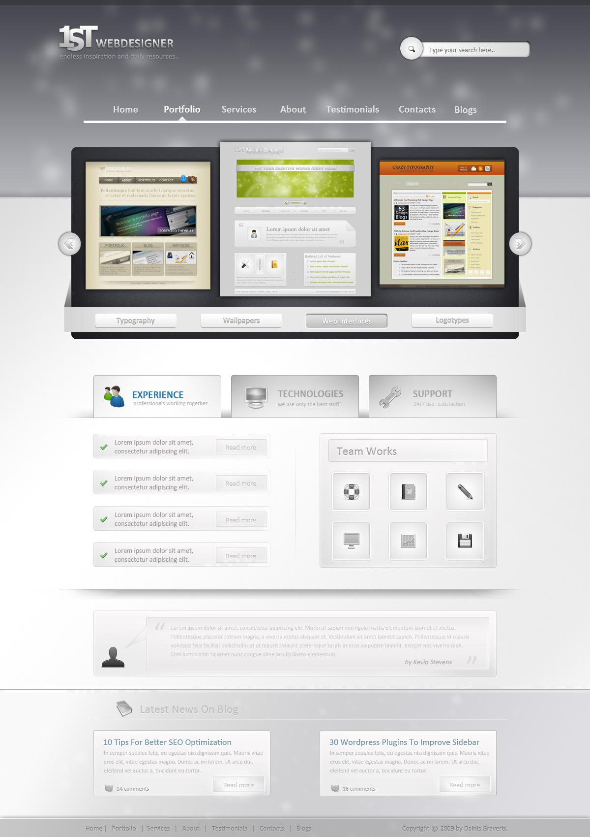
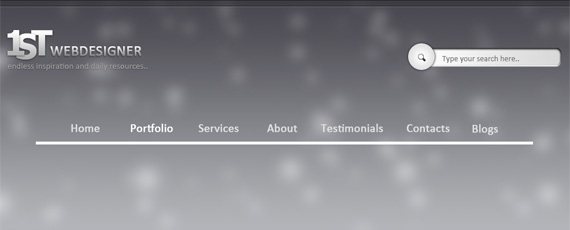
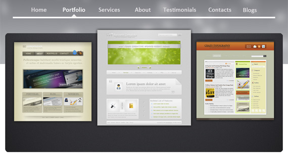
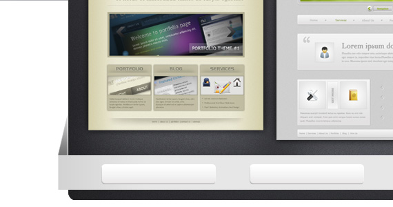
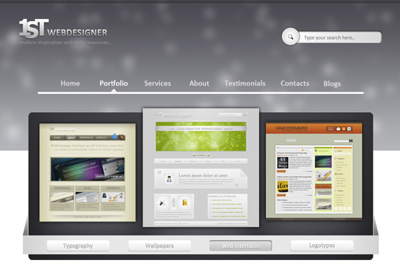
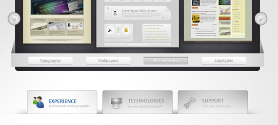
This is what we will create, click on image for full preview:
Step 1 – Creating New Document Using 16col Grid System
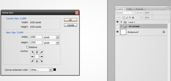
Please download 960gs Photoshop template here and open 960_download\templates\photoshop\960_grid_16_col.psd file.
Hit ALT+CTRL+I or Image/Canvas Size and put new size 1200×1700px. Hit Enter. Select Background layer,set foreground color to White (#FFFFFF), press ALT+DELETE to fill whole background with white color.
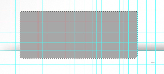
Step 2 – Header Background Creation
Rename that Layer 1 folder to Header and create new layer there pressing CTRL+SHIFT+N. Rename it to – “Header Gradient”.
Notes
You can show/hide grid on/off pressing CTRL+;
You can show/hide rulers on pressing CTRL+R (I always show them, but I just tell this in case you don’t use them).
Take a new guide and put it on 400px. Now take Rectangular Marque tool and select that area. Use linear gradient with values – #b3b6ba to #47464e.

Step 3 – Create More Interesting Background
Create a new layer and call it “Lightning”.
Now let’s switch to Brush tool, we will use soft rounded brush with hardness 0%.
Press F5 or go Window/Brushes to bring up brush panel. Use these settings:
Brush Tip Shape:
- Diameter: 50px
- Hardness: 0%
- Spacing: 1000%
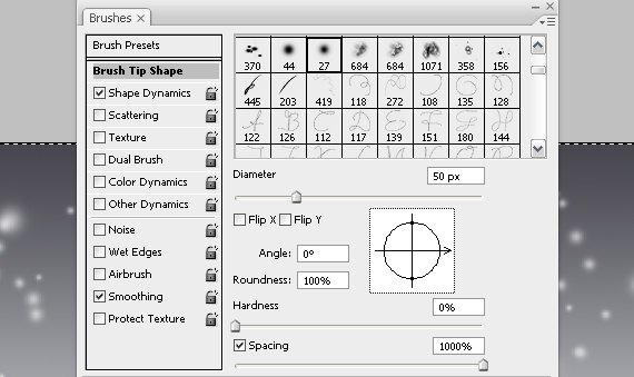
Shape Dynamics:
- Size Yitter: 100%
- Minimum Diameter: 30%
With these settings use foreground color white #ffffff and just click and drag from left to right on that gradient.
Apply Filter/Blur/Gaussian Blur with 10px Radius and you should come up with pretty good effect.
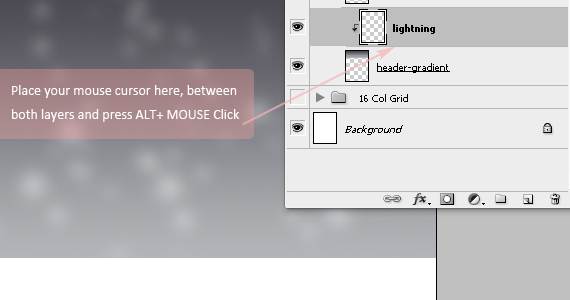
To make visible only that lightning which is upon “header gradient” layer we need to make “lightning” layer dependent.
Step 4 – Little Header Upper Section Styling
You can skip this step if you want but I wanted a little bit darker line at the top of our design.
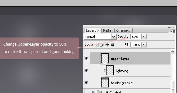
Create a new layer “Upper Layer”, put foreground color to #2e2f33, select rectangular marque tool and create selection 20px high.
Press ALT+DELETE to fill it with that dark color and change “Upper Layer” opacity to 50%.
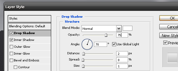
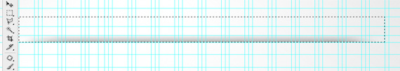
Step 5 – Add Simple Styled Line
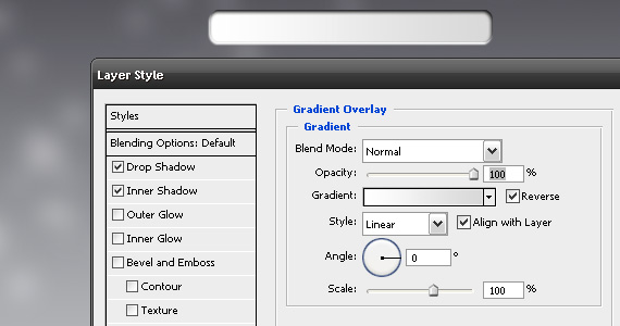
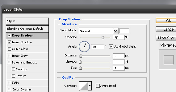
Create a new layer “Border”. select Single Row Marque Tool to add 1px line between that dark line and header.
Add these blending options to this layer:
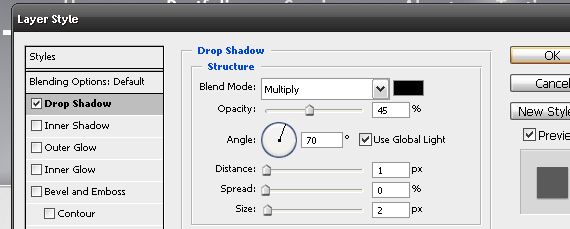
Drop Shadow:
- Blend Mode: Normal
- Color: #a5adb5
- Opacity: 40%
- Distance: 1px
- Size: 1px
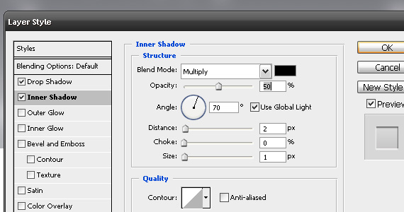
Inner Shadow:
- Blend Mode: Multiply
- Color: #000000
- Distance: 1px
- Size: 1px
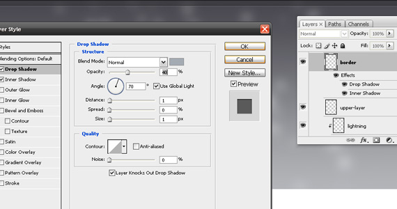
You should get good looking border now!
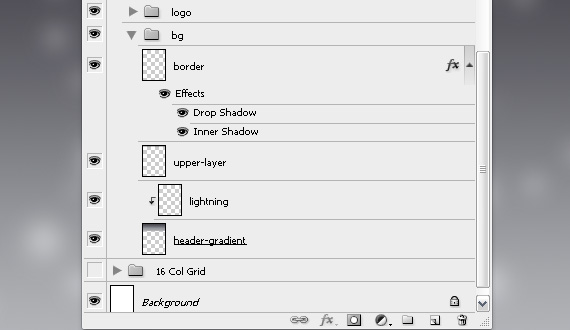
Step 6 – Keep Yourself Organized!
We will have a lot of layers here, so it’s really important that you keep all layers organized.
Select all header layers we have created until now – “Header Gradient, Lightning, Upper Layer, Border” holding CTRL and when all of these layers are selected, press CTRL+G to group them in new folder – call that folder “BG”.
Now create a new layer and press again CTRL+G to create new group and call it “Logo”.
Step 7 – Logo Text Effects
I did also quick text effect logo, but I will not go detailed about it, since I believe it’s not something unique.
I put logo in the left top side, which is usual placement for logotypes. Later we will add search button on the right side, to balance our composition.
In letters 1,S,T which I added separately I used Tahoma, 60pt, Strong, Bold and All Caps.
Blending Options:
Drop Shadow:
- Blend mode:Multiply, #000000
- Opacity: 50%
- Distance: 1px
- Size: 4px
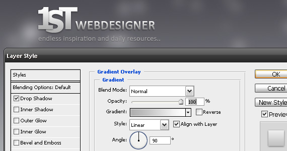
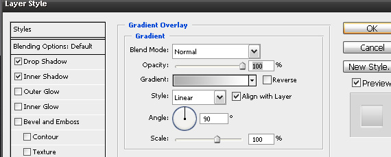
Gradient Overlay:
- Opacity: 100%
- Gradient: from #b0b0b0 to #ffffff (white)
Also I added slogan there: “Endless inspiration and daily resources..”, where I made text a lot smaller and a little bit darker, so the main attention grabber is logotype and only then comes slogan. Only thing I added was subtle Drop shadow to slogan text.
Step 8 – Search Input Area
Right now, let’s add search button on the right side. You can use horizontal guideline so logotype and search button are on the same level.
8.1. Create a new layer and call it “input box”, take rounded rectangle tool (U) and put corner radius to 5px. Draw it on the right side, mine is 260px width and 30px height.
Note – Press F8 to get Info panel – there you can see the size of your object while drawing.
Now add following blending options to Input box:
Drop Shadow:
- Blend mode: Normal, color: #ffffff
- Opacity: 100%
- Distance: 2px
- Size: 1px
Inner Shadow:
- Blend mode: Multiply, color:#000000
- Opacity: 100%
- Distance: 2px
- Size: 4px
Gradient Overlay:
- Gradient from #ffffff to #dad9d9
- Angle: 0
Step 9 – Search button and Text
Okay, now let’s create a button. Create a new layer and call it “button”.
Grab Ellipse tool and while holding SHIFT button, create nice, rounded circle, mine has 46px height and 46px width.
Now let’s add blending options to that layer:
Outer glow:
- Blend mode: Normal
- Opacity: 60%
- Color: #292930
- Size: 5px
Gradient Overlay:
- Gradient from #ffffff to #d2d2d2
- Style: Radial
- Scale: 150%
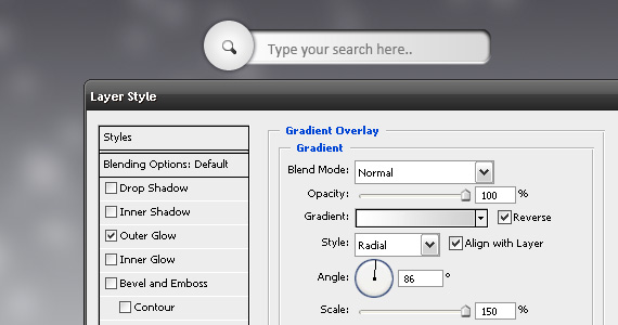
I added simple Search icon which is very easy to create by yourself  , but for this tutorial, just download this *.png search icon and add in the center of your circle.
Add some subtle text as well in input box and congratulations – we are done with search section!
Group all the search layers and call that group – “Search”.
Note
To align different layers horizontally, vertically, distribute vertical, horizontal centers use align panel on top part of Photoshop, press V button to see that panel.
Step 10 – Main Navigation Section
Now we need to add our navigation. Create a new layer and call it “line”.
Add horizontal guideline 250px from top. Now grab Rectangle tool, color #ffffff and create rectangle 860px width, 5px height.
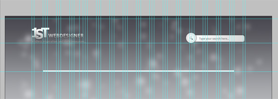
Let’s add our navigation on top of that line.
I used Calibri, 20pt, Sharp, color: #e2e1e2 and #ffffff color for active button. Also I would suggest to group all text layers to keep organized and clean.
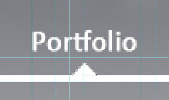
Let’s just finish now, create a new layer “active cursor”, which will describe visually which section is currently active. I chose Portfolio section in this example, so we will add that cursor under portfolio text.
Take Polygon lasso tool and while holding SHIFT to get 45 degree angle and create selection like in the image below, fill it with #ffffff (foreground color) by pressing ALT+DELETE. I added also subtle gradient to that cursor, but that’s your own choice.
Group all navigation layers by selecting them all holding CTRL and pressing CTRL+G (group), call this group – navigation.
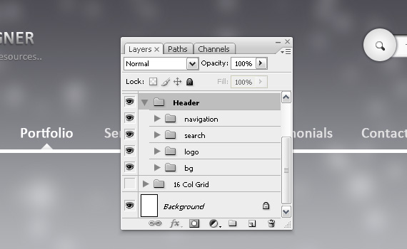
Excellent – we have finished our header section! Now select all groups we created previously – bg, logo, search and navigation and group them in new folder, call it “Header”. This is how our layer structure should look like now:
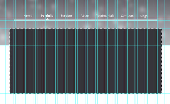
Step 11 – Featured Slideshow Background
Create a new layer and call it “bg”. Add horizontal guide, which is 300px from top, our background will be right under that guide. Change foreground color to #313237, take rounded rectangle tool with radius 10px and create 910px wide and 390px high rectangle. Center that layer and press CTRL+CLICK on bg layer to select it.
Now let’s add some lightning. Go to Filter/Render/Lightning Effects.. and create something like I’ve got:
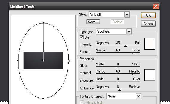
Press OK and now let’s add some noise. Go to Filter/Noise/Add noise and add 1% amount, uniform, monochromatic noise.
We should get nice looking background now, deselect bg layer by pressing CTRL+D.
Step 12 – Adding Featured Works and Shadow
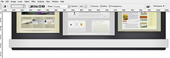
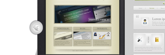
We need to add 3 featured works now, where one will stay in front and other two will be a little bit behind. In that way we will get nice 3D effect.
I used here 3 of my previous works, should be easy – just add something similar like I’ve got here, but keep in mind that left and right images should be in one size to look better.
Finally add outer glow in blending options to all those 3 images:
Outer glow:
- Blend mode: Normal
- Color: #000000, black
- Opacity: 50%
- Size: 10px
You should get something similar like I have here:
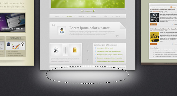
Create a new layer, behind featured work layers, take Elliptical Marque Tool (M), put feather to 20px, foreground color to white #ffffff and create selection like I’ve got. Press ALT+DELETE to fill it with foreground color, which is white. Change layer blending mode to overlay and we’ve got nice light shadow.
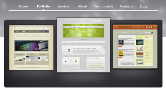
Right click on that layer and create 2 duplicates to other featured works. Finished result looks like this:
I grouped all the featured work images and shadows in separate group – “Feat-Img”.
Step 13 – Featured Work Navigation
Right, we will add also separate navigation for featured works as well as buttons later, but now create a new layer and call it “nav-bg”.
Take rectangle tool (U), change foreground color to #e8e8e8 and add 940px wide and 50px wide rectangle in the front of featured slideshow bottom side.
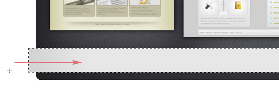
We need to add some shadow now on both sides, so change your foreground color to #d1d1d1 and CTRL+CLICK “nav-bg” layer to select it. Now create a new layer “Shadow”, find your gradient tool (G) choose this one – Foreground to Transparent, linear gradient, mode:overlay.
Apply gradient to both sides by clicking and dragging from left to right, and the same to right side, but then from right to left.
Right, now we need to get that 3D effect, just follow and you understand what I mean.
Create a new layer, call it “Left Side”, zoom left navigation side, take Polygonal lasso tool and create selection like I’ve got! Fill it with color.
Let’s go to blending effects now and add gradient overlay:
Gradient Overlay from #767676 to #d4d4d4 color. Duplicate this layer, CTRL+T to select it, then right click on it, flip it horizontal and add to the right side.
Okay, we have done featured navigation background, now let’s group all layers to group “Feat-Nav”.
Step 14 – Featured Work Navigation Buttons
As always, create a new layer and call it “btn1″. Take rounded rectangle tool, put radius to 5px and create rectangle.
Now add blending options to this layer:
Bevel and Emboss:
- Style: Inner Bevel
- Technique: Chisel Hard
- Depth: 50%
- Direction: Up
- Size: 0
- Soften: 0
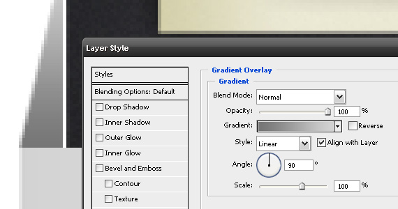
Gradient Overlay from #ebe9e9 to #ffffff, angle – 90 degree, linear gradient.
Right, now duplicate btn1 layer 3 times, rename those layers to btn2, btn3, btn4.
Great! Now let’s create active button are as well. I picked btn3 layer and just changed blending options:
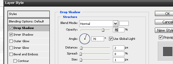
Drop Shadow:
- Blend mode: Normal
- Color: #FFFFFF
- Opacity: 75%
- Distance: 2px
- Size: 1px
Inner Shadow:
- Blend mode: Multiply
- Color: #000000
- Opacity: 50%
- Distance: 2px
- Size: 1px
Gradient Overlay: linear gradient, from #c2c0c0 to #e2e2e2.
Great! Now just add some text, grey on inactive areas, but white on active area. Looks pretty good already right?
Now group all navigation button and text layers and call that group “buttons”.
This is how far we are now:
Step 15 – Rounded Featured Work Buttons
Now we will add some rounded buttons on this featured work section so it would be easier understandable for new visitors.
Actually I just duplicated that search button and then put on some arrows and that was it.
Right, when you have those two buttons duplicated, group them in separate group called “rounded buttons”. I hope you know how do to that already.
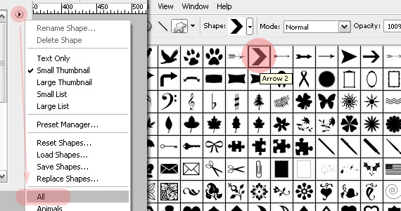
I’ll just explain how I got those stylish arrows. As always, create a new layer, call it “arrow”.
Select Custom Shape Tool (U), and find Arrow 2. If you haven’t got such shape, click on little arrow button and load all shapes – you should see now arrow shape as well!
As you may see in rounded button picture, I added two arrows (both arrows are in the same layer in my case).
Let’s add some blending options to those arrows:
Drop Shadow:
Inner Shadow:
Gradient Overlay:
Gradient is from #b0b0b0 to #ffffff.
Duplicate your arrow layer, flip it horizontally and add to right rounded button. We are done with featured work section!
Now group all the featured sections groups in one – rounded buttons, buttons, feat-nav and feat-img and call the new group “featured-slideshow”.
Step 16
- Content Section Background
Now let’s change that white background. Create a new layer “content-bg” and put new horizontal guide 1400px from the top, so there are still 300px for navigation left.
Take Rectangular Marque Tool and create selection, where our header ends until that 1400px guide mark. Change foreground color to light grey, I used #e9e9e9 and pick your gradient tool (G) Foreground to Transparent and just put some subtle gradient on our selection from your own choice.
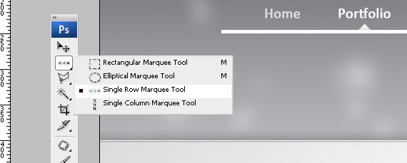
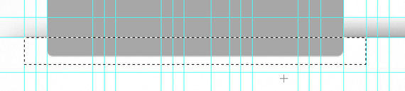
I also added 1px horizontal white line and little shadow. Let’s do it now – create a new layer “line”, grab single row marque tool, click it where header and content section meets, change foreground color to white #ffffff and hit ALT+DELETE to fill your selection.
Now press ALT+D to deselect and from blending options add:
Drop Shadow:
I created one more layer “Shadow”, CTRL+CLICK on header background layer to load that selection.
Change foreground color to ~ #696b70 and again pick gradient tool (G) Foreground to Transparent, create light shadow.like I’ve got in Single Row Marque Tool image section.
Group layers – content-bg, shadow and line and call that group “content-bg”.
Step 17 – Center Content Navigation Shadows
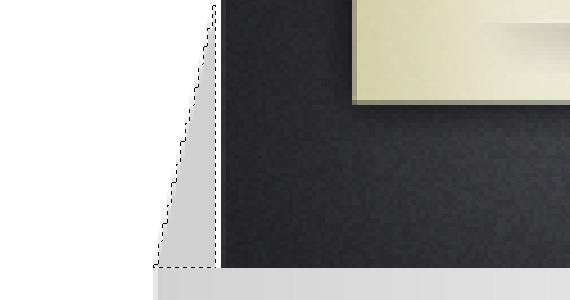
Yes, yes..we’ve got one more navigation..:) You guessed it – create a new layer, call it “Line-Up” and create a new guideline 850px high from top.
Now again take single row marque tool and click right on that guideline. Change your foreground color to #a8a8a8 and press ALT+DELETE to fill that selection.
With that line still selected, take Eraser tool (E), use ~20px soft brush and erase left and right side so it fits good in that 960px grid and ends smoothly.
Create a new layer, call it “shadow”. In this step we need to add a little shadow,, so repeat our previous step 16, where we put a little shadow on that header/content section. To get selection like I did in screenshot use rectangular marque tool.
Step 18 – Button Creation
We will create 3 buttons here, take a look at finished result here:

Let’s create a new layer, call it “btn1″ and take Rounded Rectangle Tool with radius 5px.
My button is 260px wide and 88px high, but we will delete bottom side anyway to get this good looking effect. Use your grid effectively and create rectangle a little bit over our bottom line like in the image below:
Take rectangular marque tool and create selection of that “btn1″ rectangle so you could delete that bottom side. When you have selection like I have, hit DELETE button.
Step 19 – Add Some Styling to button
Let’s add some Styling to this button to make it look good.
Add these blending options:
Color Overlay:
- Color: #FFFFFF (white) – I could select that gray button and fill that selection, but this way I am 100% sure, button will be completely white.
Stroke:
- Size: 1px
- Color: #adadad
- Position: Inside
- Opacity: 100%
Create a new layer “Shadow”, CTRL+CLICK on “btn1″ layer, take your gradient tool (G) and set foreground color to #a8a8a8. Change gradient mode to Overlay as well.
To add some subtle shadows, click and drag really far from your button and stop when you’ve got similar good looking effect, like I have.
Step 20 – Finish Buttons, Add text, Icons
Here I will not explain very detailed what I did, since it’s really simple. Just add some text, icon like I did and group all Button1 layers in group “btn1-group”.
My top left button will be active one, so I left that icon to be colorful as well as text.
About icons – I just used some free icons from WeFunction 64px x 64px.
Now just duplicate “btn1-group” 2 times and align them. Change icons,text as well to other buttons – just use subtle grey text, because only one navigation section can be active.
Desaturate inactive navigation icons by pressing CTRL+SHIFT+U or Images/Adjustments/Desaturate.
Again group all the layers, button groups in one big group “btn-section” and your outcome should look like this now:
Step 21 – Bottom Shadow and Center Separator
Remember we did – Step 17 – Center Content Navigation Shadows? We will use those two layers to bottom shadow as well.
Put guideline 1020px from the top, duplicate “Line-Up” and “Shadow” layers, flip them vertically and move right on the bottom of that new guideline.
We need center separator as well – I again just duplicated “Line-Up” layer, rotated it 90 degrees and transformed it to fit for our purposes.
Note – Press CTRL+T to transform it, right click to rotate.
Group those bottom shadow and center separator layers in group “various”.
Step 22 – Left Button Section
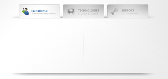
This is how our outcome will look like:
From now on I will go faster through, because as you may see we are using the same technique we used in Step 18.
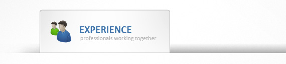
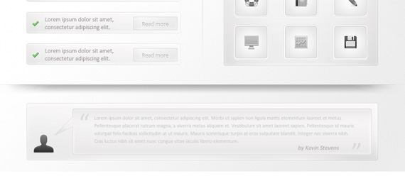
In the left section we will add four these buttons, which will be just some short text with “Read more” link to full article or section.
Take rounded rectangular tool, radius 5px and add 360px wide and 50px high rectangle. Repeat the same technique we used in Step 18 to get our section to look good. Notice also 1px stroke added to rectangle.
As for Read more button, it’s all the same, I will just explain what I did with that “Read more” text.
I used 14px Calibri, Sharp and White (#FFFFFF) color and then aplied following blending options:
Drop Shadow:
Inner Shadow:
I grouped all the layers which contain that one button and called it “feat-1″. Duplicate 3 times this group and arrange them.
We are finished with left section, just group all feat-1, feat-2, feat-3, feat-4 groups and call it “left-section”.
Step 23 – Right Section – Team Works
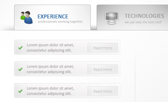
This is how our right section will look like:
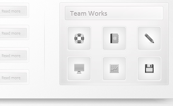
This section was meant to be as one more featured works section, just here company will showcase their previously created icons or maybe logotypes.
Just go on and use the same style and techniques. Big rounded rectangle is perfectly aligned with left side and sits right on the grid.
For all the sections use 1px subtle grey stroke and the same lightning technique from Step 18.
I’ll just stop on white/grey border in featured work section. To get that effect, CTRL+CLICK on icon background layer, like in the image below:

Create a new layer now and then go to Select/Modify/Expand – put ther 2 pixels and hit OK.
Now change foreground color to white #FFFFFF and press ALT+DELETE to fill that selection. Put your white layer behind icon background layer and holla – you’ve got good looking border effect!
For the text “Team Works” use the same effect we did in Step 22 with Read more text, just now put text color to be grey.
If you are finished again organize yourself and group all layers in group “Right-Section”.
Step 24 – Testimonials Content Section
In the last blank content space we will add client testimonials. Create that rounded 5px rectangle to be perfectly aligned with Left-Section and Right-Section rectangles and again remember to use grid and guidelines to make that process easier.
With all the previous steps, you should be able to do this yourself. If you don’t, go back and repeat previous steps – it’s important to get the most out of this tutorial!
Step 25 – Footer Section
We have only 300px left blank so let’s finish! For background we will use the same header image, just a lot more lighter version.
Repeat Step 2 And Step 3 here, just now use very light gray color #d7d7da to almost white #f9f9f9 in your gradient. As for that brush, you can actually just duplicate that layer and not repeat the same steps over again.
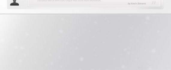
Again on footer we will use the same techniques, so I will not repeat those steps. You should be able to figure out now how to add glance to your buttons, use icons and text effects effectively!
Just leave like 40px high line for alternative navigation and copyright information. Add more shadows, lines, lightnings, shadows, text effects, icons and you should get really good outcome!
This is what I came up with:

And we are finished! Don’t worry if you didn’t get everything – I am here to help and remember this is an intermediate tutorial, though I still tried to keep everything as simple as possible. If you feel I left something out or you didn’t get something please just write in comments and I am sure I will give you the right answer!
Yes, and actually this is my first web design photoshop tutorial – and I am really proud of it! More will come and hopefully in future I will also be able to cover coding part as well. For now, we will learn together how to create advanced and high quality web designs.
Once again if you don’t use DeviantArt regularly I strongly suggest you to involve in that friendly community and check out my DeviantArt profile as well. I will update it regularly from now on so add me to DeviantWatch or Subscribe to this blog – there will be a lot more good things to come!
In future I may offer free *.psd versions for only premium users, but now you are able to download my *.psd version of this design for free, however I would like to ask for some credits if you use that design for future projects.